Logo Design
I love logo design because it's always different. Every creation has its own distinct personality, as do those requesting the design. Where one client may give you free reign, another may have very tight parameters. It's never black and white ... unless, it is. My process almost always starts playing positive and negative space off one another. Unless there's a brand color palette in place, color application is evolutionary. For me, that first glance has to read clearly, even at its most basic level.
Also ever changing is the philosophy behind each design. Is it representing a corporate behemoth, a boutique, a personality, a program or service? I usually extract a great deal of enjoyment in that exploratory journey, asking questions that sometimes surprise clients. The occasional, "Gee, I hadn't thought of that," lets me know I'm on the right track, and by the same token, lets them know this isn't just about a "bug" on their business card.
AXtraWeb
Charged with bringing a fresh look and complete rebuild, this platform delivers all sorts of information and material to UltraLux's representative travel agencies. A global extranet that became its own sub-brand and eventually, a platform for UltraLux's B2B connections throughout its entire worldwide reach, including their owned agencies as well.
Below are variations of the redesigned logo that made it into the final round, two of which incorporated the globe. The globe was part of the original logo design along with the swash. It was recommended to the client to chose one or the other, but not both.


Part of rebranding and rebuilding the AXtraWeb site included making improvements both tangible and intangible. To that end, with the client's permission, we concocted an Easter egg hunt to engage Users and encourage them to explore the new site. The logo centered around correcting past performance deficiencies, highlighting the new page-load times and new look of the site.

Final version. Runner-ups follow.



The second concept that made it as far as logo workups was The Hidden Treasure Hunt. In the end, the emphasis needed to be on the improved speed and functionality ... the enhanced site content would prove to be a jewel on its own.



JW Aluminum
I've had the good fortune to do a number of logo projects for JW Aluminum A few examples are showcased here. I had hoped for the big enchilada—the main corporate logo—but the decision was made to keep what they have, citing brand equity, and punch it up with a patriotic tagline. So, I'll share with you here what could have been, but lament not, for down the pike came Boilermaker.

Boilermaker
An internal name for a really big deal. JW Aluminum bills itself as The Leading Aluminum Rolled Products Company in the World. And to back up that claim, they recently completed a $250,000,000.00 expansion of their Goose Creek, SC facility. In the corridors of American-made metal, the expansion project was known under the code name Boilermaker.



Next Gen WIN Teams
WIN is the JW Aluminum culture. It goes far beyond team building. It's truly a philosophy of care for one another and empowerment.


Aluminators
There are a lot of extreme things that go on at JW Aluminum, not the least of which is melting metal. The melters throw off incredible heat. There is heavy equipment all around and even above you, hoisting and moving gigantic coils of pristine aluminum. These folk don't just work metal, they live it and they are proud to so ... hence the name of their softball team (they still owe me a shirt).

RecycAL 3105
Apart from safety, JW Aluminum is heavily invested in sustainability. If you look at my portfolio page for JW Aluminum, you'll see how amazingly recyclable aluminum is. It is truly a wonder metal. It was a point of pride for me to be asked to develop their RecycAL 3105 product logo. In addition to using the corporate color palette, it was important to incorporate both the Periodic Table symbol and recycle logo. Several iterations follow.



SkinPro Studio
In addition to her entrepreneurial spirit, the SkinPro Studio founder is also philanthropic in her approach to business. Donating 30% of the fees for oncology & pregnancy skincare treatments to a local charity to support women and children in need is a huge part of their mission. It was an honor to have the chance to work with SkinPro in the development of their logo. Below are some of the iterations the logo went through as we evolved the design into the final product.

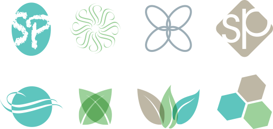
Various graphic elements developed for possible logo application. Symbols ranged from typographic representation to stylized plants and flowers to reflect natural products and molecular structure.
Integrated Technologies
Integrated was found by one of several serial entrepreneurs I've had the privilege to know, work with and call my friend. I.T. started out as a custom programming shop, grew into a company doing integration in the pre-press, corporate graphics and ad agency space. After the internet started to dominate, the decision was made to morph the company back to consulting and programming.


Additional Logo Designs
Here, I'm presenting just a sampling of the evolutionary process I generally follow as designs evolve. Unless colors are specified by the client (such as was the case for Integrated Technologies), or there is a strong reason to lean a particular way, my preference is to start out exploring the positive and negative space relationship between potential logo images and typographical components.






IDepo
Just to change it up a bit, there are occasions where were told to go in with guns blazing. Don't show the client how the sausage is made; just show them lots of options. This was one of those times ... wide open on the style, color palette, font, tagline ... polish it up and throw it against the wall. It's a very gratifying feeling to hear a client say, "Love them all ... can't decide!"




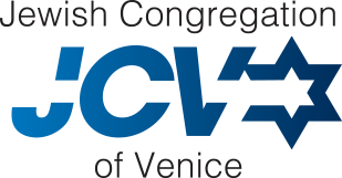
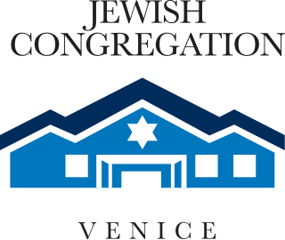
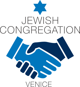
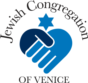
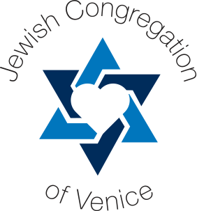
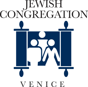
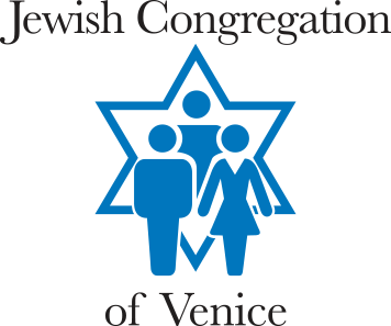
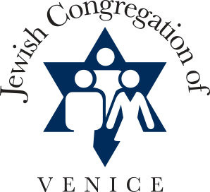
Jewish Congregation of Venice
A friend and former neighbor accepted a position on the board of her synagogue. She thought their logo needed updating. What follows are some ideas created to help the board explore how to best convey their fellowship and sense of community.
Creative Foundry
Founded in 2014, Creative Foundry was established as my freelance persona. The name and logo image were a blatant play to win the business of JW Aluminum. If you've ever gotten sucked into Mad Men, then you know everyone at the fictional Sterling Cooper smokes Lucky Strikes. Well, I'll take my metal molten, thank you very much.
Okay, so a little pandering. Thank goodness I never went into politics.
